Posted on Tue, 12/13/2016 - 06:05
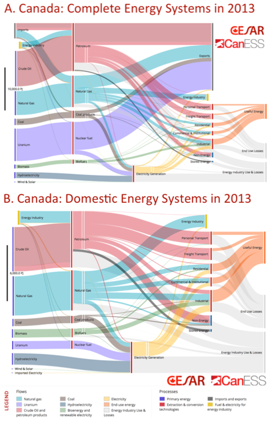
Figure 1. Sankey diagrams showing the flows of energy (petajoules (PJ)/yr) through the complete energy systems of Canada in 2013 (A) and through the pathways needed to serve domestic energy demand (B). Follow this link for interactive sankeys.
The result is a compilation of national (Figure 1) and provincial visualizations (Figure 2) for either the complete energy systems of the jurisdictions (including imports and exports; Figure 1A) or for only the portion of the energy systems needed to meet ‘domestic’ demand (Figure 1B & 2)2. Individual diagrams can also be generated for each of the 24 years between 1990 and 2013 and scaled as either PJ, GJ/capita and MJ/2002$ GDP3. Check out Figure 3 for 'driving instructions' in how to work with the interactive Sankey diagrams available at the web portal.
Insights and Perspectives
A high level overview of these CESAR energy flows can be used to illustrate the following realites concerning the energy systems of Canada:
- The dominance of non-renewable energy sources (Figure 1B). The diagrams drive home the extent to which oil, gas, coal and uranium dominate our energy use. Canada’s domestic primary supply of energy in 2013 was 81% non-renewable, with hydropower (13%) and bioenergy (6%) providing most of the remainder. Solar photovoltaics and wind are very small as a proportion of primary energy production in Canada, but have been growing rapidly in recent years.
The range of dependence on non-renewable energy sources varies by province, from a low of 50% in Quebec with its vast hydroelectric resources to 97% in Saskatchewan. It is worth noting that over the past 24 years to 2013, there was little change in the share of domestic energy provided by non-renewable resources. - We export about as much energy as we consume domestically (Figure 1A), including all the fuel and electricity we consume to produce the energy exports. In 2013, Canadian energy exports totalled more than 16,000 PJ, or about 12,000 PJ after subtracting fossil fuel imports. Domestic consumption, including consumption of the energy industry itself, also totalled about 12,000 PJ in 2013, of which the energy industry itself was the largest sector (at 4,400 PJ).
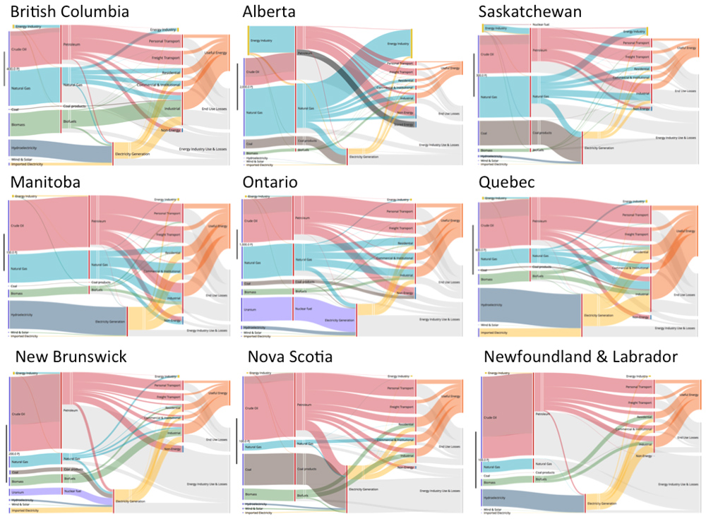
Figure 2. Provincial Sankeys (all except PEI) showing the flows of energy to meet domestic demands for energy, including the within-province demands for processing / converting energy commodities that are exported to other jurisdictions. Follow this link for interactive sankeys.
- Canada’s largest energy export is uranium (Figure 1A). In 2013, Canada exported more energy in the form of uranium than any other net energy export, including 1.2 times more than oil, and 2.2 times more than gas. At over 6,500 PJ, uranium exports were calculated on the assumption that the uranium fuel would generate a similar amount of heat as produced by a CANDU reactor in making steam for power generation. That amount of uranium is equivalent to more than a billion barrels of oil, and more than the total natural gas production in Canada in 2013. Canada’s oil and gas exports have a higher profile than uranium because they contribute more to provincial and national economies than does uranium.
- The energy system has inefficiencies (Figure 1A). The fuel and electricity consumed or lost in the production and delivery of fuel and electricity to end users or to export markets constitutes nearly 20% of energy use, while the conversion loses associated with the end use of fuels and electricity are often as high as 50% or more of supplied energy. Consequently, less than 40% of primary energy production typically ends up in the form of useful energy.
Thermal generation of electricity using uranium, coal, gas or oil is particularly inefficient, often generating about twice as much low temperature waste heat as it does electricity. For example, in 2013, Ontario’s nuclear plants generated 78 billion kilowatt-hours of electricity, enough to supply over half the annual power consumption of the entire province, but at the same time they emitted 2.4 times that much energy into the Great Lakes in the form of warm waste water. - Regional variability. Figure 2 provides a graphic illustration of how diverse Canada's provincial energy systems are from one another. As Canadians, we know that provinces differ greatly in their access to energy resources and in their ability to meet not only their own needs, but to export energy to other provinces and internationally. However, Figure 2 only shows the 'domestic' energy systems of provinces; in other words, the visualizaitons show only the flows of energy required to meet within-province demand for fuels and electricity. Therefore, the diversity in the colour and shape of these visualizations drives home the fact that substantive inter-provincial variability exists in the magnitude (even on a per capita basis) and nautre of fuel and electricity demand by sector of the economy. Certainly, each province has its own 'energy story', emphasizing the need for them to identify their own path towards sustainability.
- The systems change slowly. Moving through time (Explore the CESARnet.ca website portal here) reveals the changes that have characterized the provincial energy systems over the 1990-2013 period: coal use is down in most provinces, particularly Ontario and Nova Scotia; nuclear power is phased out in Quebec; PEI’s electricity supply shifts from oil-fired generation to wind and imported power from New Brunswick; natural gas emerges in Nova Scotia and New Brunswick; and wind and solar power start to appear, albeit as relatively small sources. But by-and-large, for any particular province, the essential patterns in 2013 are similar to those in 1990 – the energy systems have not changed in a fundamental way over this period.
- Trends in Energy use per GDP. The energy flows per capita and per dollar GDP Sankey diagrams (available here and here, respectively) reveal some interesting trends over the 1990-2013 period. While per capita energy consumption has remained fairly constant, there has been a 28% decline in energy use per dollar of GDP.
Other work we have done to analyze the reasons for this decline have shown it to be the result of several factors including a decoupling of residential and personal transportation energy consumption from GDP growth, structural shifts in the economy both between and within sectors that have had the net effect of reducing energy intensity, and improvements in the technological efficiency of fuel and electricity utilization. Check out this blog post for more on energy : GDP trends in Canada.
We look forward to learning where CESAR's new visualizations of Canada's energy systems takes the thinking of others. We hope that the information contained in these Sankey diagrams will be useful in informing policy and investment decisions related to energy systems change in Canada. After all, if you can visualize Canada's energy systems, how can one hope to manage them towards sustainability?
Features and Users Guide to the new CESAR Sankey Diagrams
To select and display which of the 1584 Sankey diagrams that users may find to be of interest, there is a control panel located above each Sankey diagram on the web portal. Figure 3 provides a simple ‘User’s Guide’ to that Control panel, and also provides directions on how to interact with each Sankey to extract additional information.
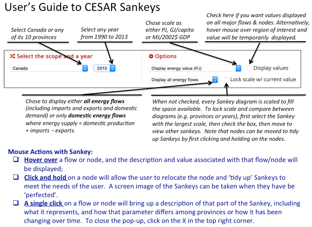
Figure 3. User’s Guide to Cesar Sankey diagrams.
The web-based software automatically scales the Sankey diagrams to fill the available screen space, but if there is a desire to do inter-provincial or multi-year comparisons, the user can ‘lock’ the scale for the province or year with the largest values, and then view all other provinces on the same scale.
For those who are familiar with the first generation of CESAR Sankey diagrams, these new visualizations contain a number of enhancements, including:
- Each Sankey has been stretched horizontally to make more efficient use of most computer screens;
- Flows of oil are now separated into two shades of red, with the darker red shade representing the flows of crude oil, and the lighter shade representing the flows of refined petroleum products;
- A new, end demand node has been added, called ‘Stored Energy’. This is energy that has been recovered, but which is being stock-piled and is not currently being used. Petcoke from oil sands operations account for the majority of the ‘Stored Energy’. In future enhancement of the CESAR Sankey diagrams, this Stored Energy node will take on a greater importance;
- Conversion losses are now separated into (a) those associated with the production and distribution of fuels and electricity by Canada’s energy industries, and (b) those associated with end use demand for fuels and electricity.
- When displaying ‘domestic’ energy flow for provinces that recover and/or process more fossil fuels than they use for domestic consumption (e.g. AB, NB, NL), conversion losses are large relative to the domestic use of that energy flow (See Figure 2). This is because the conversion losses include the energy consumed in recovering / processing energy commodities that are exported as well as those used domestically.
Stay tuned for additional enhancements in the Sankey diagram visualizations that CESAR will be producing and releasing over the next year.
Footnotes
1 A Sankey diagram is a visualization where the magnitude of the flow of something (such as energy or a material) is represented by the thickness of arrows and the size of ‘nodes’ in the flow pathway. These visualizations are named after Captain H. Riall Sankey who used this kind of diagram in 1898 to represent the flow of energy in the operation of a steam engine.
2 In the domestic representation of energy systems, the supply of each fossil fuel energy source in the visualization is calculated as production + import – export.
3 GDP= Gross Domestic Product – expressed in 2002$ Cdn
Comments
carsjam replied on Permalink
Fantastic work
Simply mesmerizing, with well-thought out interactivity and drill down.
2 small items to look at: I'm viewing this in Firefox, and the wind/solar label is cut off so that only top half of the text is visible. It does not appear that way in your screenshots, so maybe it's my text size settings, but you might want to look into it.
Also, it might be helpful to add the word "Scale:" to the scale bar label. It took me a bit to figure out what it was. I like how you made it easy to move around.
I wish I had all day to play with this! Great work! I hope you can maintain it as 2014 and future data are available.
Thanks!
Thanks for your comments and suggestions. A response:
• Wind/Solar cut-off: Thanks for identifying this problem. We have since changed the code we use to display the image and now it seems to display appropriately in Firefox and other browsers.
• Scale. To build these diagrams, we use the Sankey plugin with D3 (https://d3js.org/), and we have not yet figured out how to add vertical text, which is what we would want to use to keep the diagram less cluttered. We are exploring ways to do this and we are also planning to add an instruction page linked to the Sankey diagrams that could help.
• Updating. It was a major effort to update the end date of the historical series in the CanESS model from 2010 to 2013, but in doing so, What? Technologies Inc (owner of the CanESS model) added a lot of background infrastructure to their model that should allow us to do this more quickly in the future. The constant battle for us is getting reliable government data needed to create these models. Over the past 10 years, the quality and quantity of energy systems data has greatly deteriorated. We are hopeful that governments interested in 'evidence-based decision making' will invest in enhancing the quality and reliability of energy systems data that makes this work possible.
We hope you will come back to our website often. We have some exciting new features coming out in 2017. Thanks again for your helpful comments and suggestions.
LiamOBrien replied on Permalink
Awesome!
Great work! I love Sankey diagrams and this is a very nice application for them. I have a PhD student (engineering) at Carleton who is using Sankey diagrams for visualizing energy flows through buildings. The challenge is always arguing that making Sankey diagrams *is* research. Anyway, I sent him to your blog to get some ideas for making this case. Keep up the nice work. I see many opportunities for collabroation down the line.