Posted on Mon, 06/26/2017 - 06:46
Energy systems – the production and use of fuels and electricity – are under intense pressure to change for the good of the environment and the economy. However, the flow of energy through these systems is not the problem. Rather it is the flow of carbon, especially when those flows bring carbon dioxide (CO2) and methane (CH4) to the atmosphere where they become greenhouse gases (GHGs).
Six months ago, CESAR released Sankey diagrams for Canada showing how energy flows from the sources we extract from nature, to the demands of society for fuels and electricity. Today, we are pleased to release a new set of Sankey visualizations – the first of their kind – showing how carbon flows through the same fuel and electricity systems.
These new Sankey diagrams come with a brand new, and improved web portal where the user can toggle between the energy and the carbon sankeys for a given province or year, to explore 1056 different Sankey diagrams. The portal has a number of other new and useful (at least to us!) features that you can learn about by checking out our brand new ‘User’s Guide to Energy-Carbon Sankeys’. Literally hours of fun for energy systems nerds!
In this blog post, which gives a nod to the 1992 US presidential campaign (“It’s the Economy, Stupid”), we try to highlight a few of the things that one can learn by focusing on carbon. For the record, in saying 'Stupid', we are talking to ourselves. Our focus, even the CESAR name, has been about energy, but the core problem is carbon. Building these Sankeys reminds us that ‘Its the Carbon’.
Comparing the Energy and Carbon Sankeys
About the Units
For the energy Sankeys, the units are in petajoules (PJ) per year, but for carbon, they are in megatonnes of elemental carbon (MtC) per year. To convert MtC/yr into tonnes of CO2 equivalents (tCO2e/yr) that are typically used when reporting greenhouse gas emissions, multiply by 3.66.
Figure 1 provides a side-by-side comparison of energy (Panel A) and carbon (Panel B) flows associated with the production and use of fuels and electricity in Canada in 2013. There are many similarities and some important differences between the two visualizations.
In CESAR Sankey diagrams, the nodes on the left-hand side represent the energy (Figure 1A) or carbon (Figure 1B) content of all the energy resources produced in (i.e. Primary energy or carbon) or imported into Canada.

Figure 1. The flows of energy (A) and carbon (B) through the fuel and electricity systems of Canada in 2013.
The nodes in the middle portion of the Sankey represent the companies in the energy sectors. They convert the energy (and carbon, if present) into fuels and electricity that are then either exported or passed to a number of demand sectors. These include transportation demands (personal and freight), building (residential, commercial and institutional), energy using industries (cement, agriculture, chemicals, etc), and non-energy uses (plastics and asphalt) Some recovered energy and carbon has little or no commercial value (e.g. petcoke), so it is stockpiled (mostly in N Alberta) and allocated to an node called ‘Stored Energy’ in these Sankey diagrams.
What is Exergy?
Exergy is the energy that is available to be used. A fuel that can create, on combustion, very high temperatures relative to the surroundings has high exergy since the differential temperature can do some valuable work.
Since neither energy nor carbon can be created or destroyed (putting aside some nuclear reactions), the sum of all flows at the right side of the each diagram equals the sum of all the flows on the left side of each diagram. In the energy Sankey (Figure 1A), the energy that was consumed (or lost by venting) through domestic processes is depicted as orange and grey flows lines that were either attributed to delivering the valuable end-use service (i.e. useful energy) or consumed as a ‘conversion loss’ in the process of providing the fuel/electricity or end-use service. While all this energy still exists, it is highly dispersed (i.e. low exergy – see box) and therefore of little economic value.
In the C sankey (Figure 1B), the grey flows are predominantly in the form of carbon dioxide (CO2), the end product of fossil fuel combustion. However, some fossil carbon may be in the form of methane (CH4), a potent GHG that can leak to the atmosphere. The dark grey flows on the right side of Figure 1B represent the flows of CO2 from the combustion of bio-based fuels.

Figure 2. The carbon content of energy feedstocks in Canada’s fuel and electricity systems. The black lines represent the range of values for each feedstock type, while the bar shows the typical value.
Although similarities exist in the two Sankeys shown in Figure 1, there are substantial differences that reflect variations among feedstocks in their carbon: energy content. As shown in Figure 2, the C content of energy feedstocks vary widely, from zero for nuclear, hydro, wind and solar to about 24 or 25 kgC/GJ for coal or biomass. Oil and most refined petroleum products tend to have 19-20 kgC/GJ while natural gas is about 14 kgC/GJ. Consequently, some of the energy flows do not appear on the carbon sankeys (nuclear, hydro, wind) while others (esp. coal, biomass) become proportionately larger relative to the flow for natural gas.
It is important to note that this C only accounts for the C that is contained within the energy feedstock itself; it does not provide information on how that C may contribute to GHG emissions. Nor does it reflect the life cycle emissions associated with recovering, refining and transporting each energy resource.
Insights from CESAR’s Carbon Sankeys
So what can we learn from a closer study of the Carbon Sankey for Canada (Figure 1B), insights that could not be gained from the Energy Sankey (Figure 1A)?
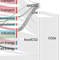
1. Visualizing CO2equivalents (CO2e). To extract the maximum amount of energy from fossil fuels, they need to be combusted in the presence of oxygen to produce CO2. This reality is reflected in the light grey flows to ‘fossilCO2’ in the C sankey (Figure 1B). Each tC as CO2 contributes one tC as CO2 equivalent (CO2e) GHG emissions.

Figure 3. Details of the C sankey showing the origin of CO2 equivalents.
However, fugitive emissions of fossil C (especially gaseous methane) does occur in Canada’s fuel and electricity systems, and those flows are tracked within the CanESS model. When displayed in the Sankey diagram (Figure 1B or Figure 3 for a higher resolution perspective), the flows are small compared to ‘fossilCO2’. However, methane is a potent GHG, with a global warming potential of 9.1 tC as CO2e per tC as CH41. Therefore, the CH4 C flows are multiplied by 9.1 to calculate their contribution to GHG emissions measured as tC as CO2e.
It is important to note that the C Sankey in Figure 1B only shows the GHG emissions coming from fossil C feedstocks. Process-base CO2 emissions such as that associated with cement or steel making, are not shown in these sankey diagrams, nor are the CH4 or N2O emissions associated with Canada’s agricultural systems or landfills.
2. Biogenic Carbon is treated differently. In Figure 1B (or Figure 3), the dark grey flows on the right side of the Sankey diagram show the magnitude of biomass flows to the atmosphere as a result of their use as fuels. However, in agreement with international convention, these emissions do not contribute to Canada GHG emissions (CO2e in Figure 1B or 3).
The convention assumes that the plants from which this bio-carbon is obtained, had recently (i.e. within the last year for crop plants, or the last century for trees) removed it from the atmosphere. Under international agreement, countries are expected to report C stock changes in their managed biological systems to ensure they are being sustainably managed. Canada does report these numbers2, but the reported carbon stock changes are not counted in national totals for GHG emissions, nor are they shown in Figure 1B since those flow only include the biocarbon associated with fuel and electricity production and use.
3. Following the Carbon from Source to Demand. Starting from the left side of the carbon Sankey for 2013 (Figure 1B) we can see that a total of 392 MtC entered the Canadian energy system that year. Canadian oil, gas and coal producers took 300 million tonnes of carbon out of the ground -- 182 MtC in the form of crude oil, 78 MtC in the form of natural gas and 38 MtC in the form of coal. In addition, 21 MtC in wood and agricultural biomass were used for energy, and an additional 72 MtC were imported in the form of petroleum, natural gas and coal.
The nodes on right side of the diagram show where all that carbon went. Half of the total carbon – fully 194 MtC – was exported as oil (130 MtC), gas (41 MtC) or coal (23 MtC). This carbon would almost all have ended up in the atmosphere when the exported fuels were burned, but the responsibility for those emissions rests with the importing country (primarily the U.S.). Another 178 MtC, (including 21 MtC of “biogenic” carbon from biomass combustion) was emitted into the atmosphere in Canada, from power plant stacks, residential and commercial building chimneys, personal and commercial vehicle tailpipes, and industrial energy consumption, including the fossil fuel industry itself. All totalled, 95% of the carbon taken out of the ground ends up in the atmosphere. The remainder is stored or sequestered, mostly in plastics and other non-consumable petrochemicals (16 Mt), with smaller quantities in oil sands tailings and petroleum coke stockpiles (7 MtC).
4. Tracking Fossil Fuel CO2 Emissions. By focusing on the light gray flows in any of CESAR’s carbon Sankeys, users have a rapid and easy way to explore the origin of the emissions of fossil carbon. Hint: hover your cursor over the flow of interest and a pop-up will appear to giving you the number of MtC flowing through that part of the fuel and electricity system.
For example, in the 2013 carbon Sankey for Canada, the fuel and electricity industries can be seen to emit 59 MtC as CO2, or 38% of the 156 Mt of fossil C that Canada emitted to the atmosphere as CO2 in 2013. The energy industry’s emissions were split evenly between power plants (29 Mt) and the oil and gas extraction and processing industry (30 Mt).
The remaining 62% of fossil CO2 emissions in 2013 (97 MtC) were associated with the demand sectors, and more than half of that (34% or 53 MtC) came from transportation, both personal and freight. Fossil carbon emissions from buildings accounted for 13% of 20 MtC and the remaining 16% (24 MtC) were from the energy using industries of Canada.
Overall, these visualizations reveal the rivers of carbon from their headwaters in the primary production of fossil fuels and biomass through to their final emission into the atmosphere from the smokestacks, chimneys and tailpipes of our industrial plants, buildings and vehicles. In this blog post, we have provided a few directions for navigating these rivers. We encourage readers to use our new portal to compare energy and carbon sankeys, explore how they have changed with time, and how they compare among provinces (especially using the per capita option). Then let us know what you discover.
Footnotes
1 The 9.1 value assumes 25 tCO2e per tCH4; see User’s Guide for details.
2 According to Environment and Climate Change Canada’s 2017 National Inventory Report, if we don’t count the C stock losses that occur on managed lands as a result of major forest fires, Canada’s managed biological systems annually accumulate about 9.3 MtC/yr. That is equivalent to about 34 Mt CO2 /yr of net removal from the atmosphere.
Comments
devillar replied on Permalink
Sankey Diagrams - Wasted Energy
Hi David and al.
Beautiful diagrams. Good work on categorizing the flow of energy.
The main story for me is the waste. All of this waste has a quality to it which can show what the potential is to harness these waste streams, to make something useful from them. For example, the blog describes the amount of hot water dumped into the Great Lakes from nuke power plants. At what quality is this dumped heat? Can it be harnessed to inject back into the energy stream?
Like your team did to qualify the quality of petroluem, I can see great potential for this research to focus on qualifying waste streams. A shade of colours to define the potential in waste streams.
All the best,
David Villarroel
Wasted Energy