Posted on Mon, 05/05/2014 - 10:56
So that is what I would like to explore in this, the second cesarnet.ca blog posting. A side benefit of this topic is that it gives me an opportunity to highlight the depth and breadth of the database resource that we are making available on cesarnet.ca. Be sure to click on the links provided and compare those images with the Canada-wide Sankey diagram presented below.
The energy systems models we build and use at cesarnet.ca (special thanks to whatIf? Technologies for access to their CanESS model) consider the energy industries (fossil fuel recovery, refineries, electricity generation etc.) as ‘commodity’ providers, supplying the energy currencies (e.g. gasoline, diesel, electricity, etc.) for five distinct energy-using (demand) sectors: residential buildings, personal transportation, commercial/institutional buildings, freight transport, and industry. The Industrial sector includes manufacturing, mining, agriculture and forestry, but - as noted above - not the fossil fuel or electricity sectors.
In addition there is a sixth sector, the “non-energy” sector, in which fossil fuels are valued for their non-energy attributes and used to produce lubricants, asphalt, plastics and other petro-chemicals and materials.
The Sankey diagram below shows only the domestic portion of Canada’s energy systems. In other words, it shows only the flows of energy needed to meet demands for the six sectors discussed above. It also shows how much of that demand is met by oil/petroleum (red), natural gas (blue), electricity (yellow), biomass-derived products (green) or other energy resources.
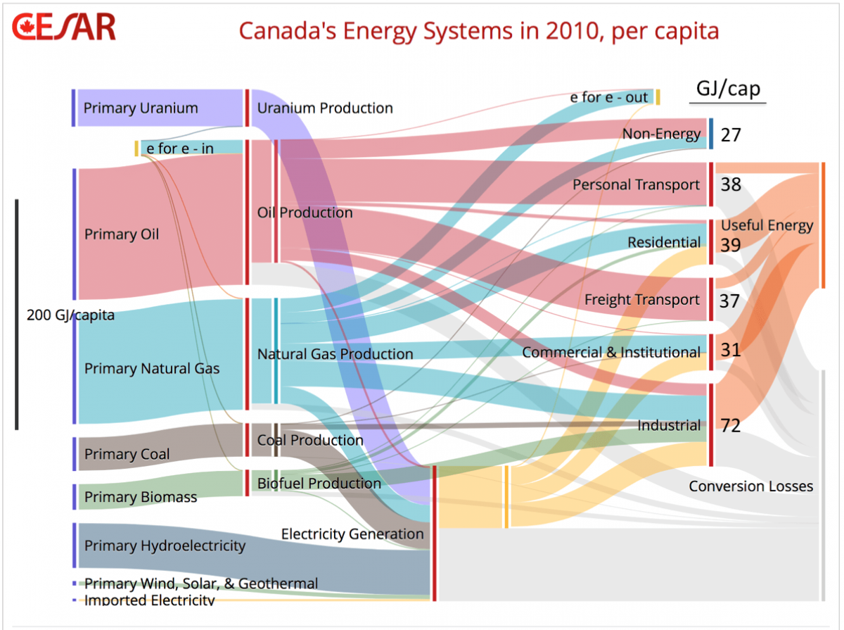
The numbers displayed on the Sankey diagram are per capita values for 2010 in energy units called gigajoules (GJ). See the insert box to get an idea how much energy a GJ represents.
What is in a Gigajoule (GJ)?
A joule (J) is the work required to produce ‘one watt of power for one second’. Since a GJ is a billion (109) Joules, we can calculate that a GJ is the energy needed to power a 100 watt light bulb, 24 hours/day for almost 4 months.
A barrel of oil contains about 6.1 GJ of embedded energy and that amount of energy is similar to the food energy that a very muscular, hard-working man would consume in a year. This calculation assumes heavy labour requiring 1.8 MJ (or 670 Calories) of food per hour for 8 hours/day, 5 days/week and 52 weeks/year. The rest of the time, our fictional overworked ‘energy slave’ gets to relax and consume food at a sustenance rate of only 0.36 MJ/hr.
So the hard work of more than 6 strong, hungry men for a full year would be required to provide the human-equivalent energy to meet our per capita personal transport demand of 38 GJ/year (see the Sankey diagram). This does not take into account the fact that internal combustion engines are more than twice as efficient as humans in turning input fuel / food into mobility.
To meet all of our end use energy demands (244 GJ/yr, not including the energy expended to recover and produce the energy commodities) every Canadian needs the efforts of 40 strong, hard-working ‘energy slaves’.
So an average family of four has 160 energy slaves! These are sobering numbers and help to explain why many of us live today like the Pharaohs of ancient Egypt.
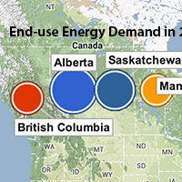
There are significant inter-provincial differences associated with each end-use category. For example, British Columbia (BC) residents had the lowest residential energy use in the nation, at 63% of the per capita energy use in Alberta (52 GJ/capita), the national leader in this category. The balmy BC climate compared to what Albertans face each winter accounts for most of this difference. However, our model also draws on government data showing that many BC buildings tend to be better insulated than those from much colder Alberta.
The story for energy use by commercial and institutional buildings was very similar to that for residential energy use.
For personal transport, BC was again the lowest in the nation at 57% of that in Saskatchewan (56 GJ/cap) the national leader. This result can be attributed to recent federal government data that our model draws upon, showing a sharp rise in fuel use for road transportation in Saskatchewan, despite a relatively small increase in population. It would be valuable to understand this trend better, since it is clearly going in the wrong direction.
As for per capita energy use for freight transport, Ontario and Quebec were only about 36% of that in Alberta (73 GJ/yr) and Saskatchewan (75 GJ/yr) the national leaders. The energy required to move freight depends on the volume and nature of the cargo as well as the mode (truck or train?). The long distances and freight intensity associated with the petroleum industry in Alberta and the agricultural sector in Saskatchewan can account for most of these large differences.
The industrial sectors include everything from auto-making to pharmaceuticals, from agriculture to steel mills and pulp and paper. This diversity is reflected in the wide range of energy intensities and energy source choices. Per capita industrial energy use is highest in Alberta (139 GJ/capita), Saskatchewan (102 GJ/capita), BC (81 GJ/capita) and Quebec (76 GJ/capita) where there are concentrations of primary processing industries such as smelting and refining, industrial chemicals and pulp and paper.
The dominant energy sources for industrial end-use in each province reflect the unique matching of natural resources and specific industries: electricity for aluminum in Quebec, natural gas for fertilizer and petrochemicals in Alberta, petroleum for agriculture in Saskatchewan and biomass for the forest products industry in BC.
The use of petroleum and natural gas for plastics and petrochemical production dominate the non-energy sector, and not surprisingly Alberta had the highest per capita energy use in this sector. It was more than 100 times that of Newfoundland.
The energy systems of Canada reflect our diversity, history and natural resource allocation within the nation. Yet despite large provincial differences, in many critical areas of energy demand (like personal mobility and residential energy use) Canadians are more similar than they are different.
Concerns about climate change demand that we transform these energy systems to ones that have a much smaller carbon footprint. Since these six end use energy categories account for about 50% of Canada’s total GHG emissions, they must be a focus for major change.
In future blog postings, we will show how Canada’s interprovincial diversity in energy use patterns can be an asset for addressing the challenges of climate change.