Last update: June 2017
What Diagrams are Available (and Where)?
What is a Sankey Diagram?
In a Sankey diagram, the thickness of the lines are in proportion to the magnitude of the flow (typically energy or material flows) being represented by that line. They are named after Captain Matthew Sankey who used this type of diagram in 1898 to illustrate the flows of energy through a steam engine.
The CESAR/CanESS1 Sankey diagrams referred to in this user’s guide can be found by following the link to Sankey visualizations on the cesarnet.ca website (http://www.cesarnet.ca/visualization). These diagrams show energy and carbon flows associated with provincial and Canadian fuel and electricity production and use.
The Cesarnet portal provides open access to 1056 different Sankey diagrams, including:
- [Regions] Any of 10 provinces and 1 national visualization for …
- [Year] … any of 24 years of simulation (1990 to 2013, inclusive), depicting either …
- [Energy or Carbon] … flows of energy or flows of carbon, showing either …
- [All or Domestic-only] … all flows (including imports domestic production and exports) or only domestic demand (i.e. for each energy resource, input energy = Imports + Production – Exports)
For each of the 1056 Sankey diagrams noted above, the user has the ability to select the a variety of options for how they will be displayed. The options the including:
- [Units] Three different units for the:
- Energy Sankeys can be scaled in units of petajoules per year (PJ/year), gigajoules per capita per year (GJ/cap) and megajoules per gross domestic product in 2002 dollars per year (MJ/GDP);
- Carbon Sankeys can be scaled in units of megatonnes elemental carbon per year (MtC/yr), tonnes carbon per capita per year (tC/cap) and kilograms carbon per gross domestic product in 2002 dollars per year (kgC/GDP).
- [Display Values] With or without values being displayed on all the major flows and nodes.
- [Auto vs Fixed Lock] Automatic vertical scaling to fill the space available for the Sankey or user-controlled scaled relative to any other sankey diagram
- [Redesign] The ability to move nodes (and therefore the flows) around on the diagram
Features of CESAR Sankey Diagrams
Figure 1 provides an example of a CESAR Sankey diagram showing energy flows in Canada in 2013. Features to note include:
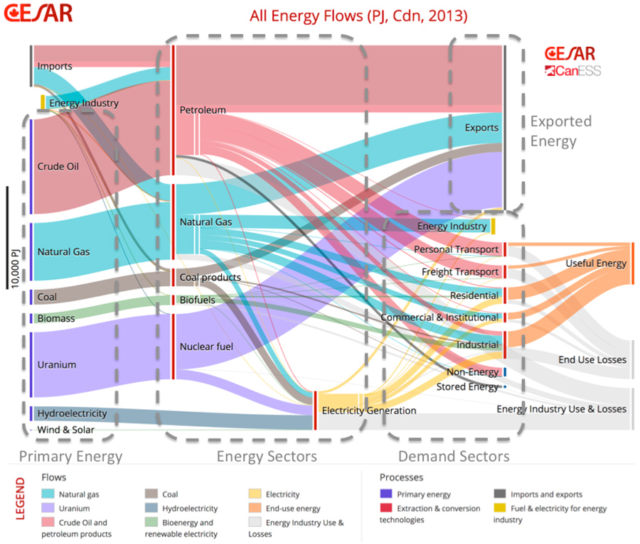
Figure 1. A Sankey Diagram showing the flows of energy in Canada in 2013. Modified from an image created on the CESAR website (http://www.cesarnet.ca/visualization).
- The scale on the far left shows the vertical width of flows equivalent to 10,000 PJ/yr. The different colour flows represent different energy resources and all flows are calculated from higher heat values (HHV).
- Estimates of primary energy recovered from nature in Canada is shown on the left, surrounded by a dashed line. Note that Canada also imports from other nations some oil products (red), natural gas (blue) and coal (grey). Imports are primarily in eastern Canada (top left). Uranium-based energy is calculated based on the heat that would be generated by this amount of uranium produced in Canada assuming use of a Candu nuclear reactor.
- The energy sectors convert these forms of primary energy into fuels and electricity. In the case of the oil flows, the darker red colour shows the energy (or carbon) in crude oil and the lighter red colour shows the refined petroleum products. Of course, energy is consumed in the recovery, upgrading/refining and transport of fuels and electricity, and that energy use is shown as light grey flows to the far right node “Energy Industry use and losses”. When a second form of energy (e.g. natural gas) is required to recover and process a primary energy resource into fuels (e.g. oil), those energy requirements are shown to move to the ‘energy industry’ node on the right side of the diagram and then enter again through a similarly labelled ‘energy industry’ node on the upper left side of the diagram. Of course, energy is consumed in the recovery, upgrading/refining and transport of fuels and electricity, and that energy use is shown as light grey flows to the far right node “Energy Industry use and losses”. When a second form of energy (e.g. natural gas) is required to recover and process a primary energy resource into fuels (e.g. oil), those energy requirements are shown to move to the ‘energy industry’ node on the right side of the diagram and then enter again through a similarly labelled ‘energy industry’ node on the upper left side of the diagram.
- The demand sectors use the fuels and electricity provided by the energy sector to meet their needs. Note that some demand sectors are heavily reliant on oil products (e.g. transportation), while others are more reliant on electricity and natural gas (e.g. residential, commercial and institutional buildings), and others have significant demands for all fuel types (e.g. industrial). The non-energy uses for fuels include the energy (and carbon) locked up in materials such as plastics, carbon based chemicals, asphalt and carbon-based steel. The stored energy node represents the petroleum coke produced during oil sands upgrading which is stockpiled and not currently used.
- The separation of energy flow from the demand sectors into ‘useful energy’ and ‘End use losses’ is a rough estimate based on knowledge regarding the efficiency of currently deployed conversion technologies such as internal combustion engines (20-25% efficient) or natural gas furnaces (65-92% efficient), etc.
- More than half of Canada’s primary energy is exported to other countries, primarily the USA.
CESAR’s Sankey diagrams can also show the flows of carbon. Figure 2 provides a comparison of energy (left side) and carbon (right side) Sankey diagrams for Canada in 2013. Note that:
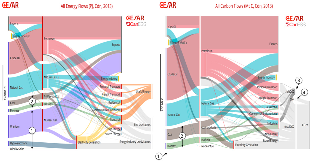
Figure 2. Flows of energy (left side) and carbon (right side) associated with fuel and electricity production and use in Canada in 2013. See Figure 1 for the legend. See the text for the relevance of the numbers.
- The carbon-free flows of energy to electricity (nuclear, wind, solar) are not present in the carbon sankey diagram (Item (1) in Figure 2).
- Compared to natural gas, the coal and biomass flows (Item (2) in Figure 2) are relatively larger in the sankey showing carbon flow than in the sankey showing energy flow. This is because carbon emissions associated with combustion of 1 GJ (HHV) of natural gas is lower than that associated with coal or biomass production (Figure 3).
- Since the biomass carbon was recently extracted from the air, when it returns to air following combustion (Item (3) in Figure 2), It is not counted as a greenhouse gas. In the carbon sankey (Figure 2, right side), these biological flows are depicted in a darker grey colour, and do not connect to the far right side node showing MtC/yr as CO2 equivalents (CO2e).
- Carbon flows associated with the fugitive emissions of methane (CH4) from fossil fuel operations are shown as item (4) in Figure 2. CH4 is a potent greenhouse gas with a global warming potential (GWP) of 25 times carbon dioxide (CO2) when expressed as tonnes CO2 equivalent per tCH4. However, the carbon flows in Figure 2 are in units of tonnes of elemental carbon so the mass C-based global warming potential was calculated to be 9.1 tC as CO2e per tC as CH4 using the following equation:
GWP(C) = GWP X (MWCH4/AWC) X (AWC/MWCO2e) = 25 X 16/12 X 12/44
Where:- GWP(C)= mass C based global warming potential in units tC as CO2e/ tC as CH4
- GWP = mass based global warming potential = 25 tCO2e/tCH4
- MWCH4 = Molecular weight of CH4 = 16 tCH4/Mmol
- AWC = Atomic weight of carbon = 12 tC/Mmol
- MWCO2e = Molecular weight of CO2 = 44 tCO2/Mmol
- To convert the carbon flows from the units of MtC/yr to units of MtCO2 or tCO2e, simply multiply the MtC values from the carbon sankey diagrams by 3.66.
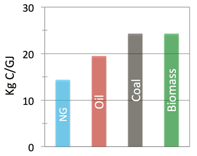
Figure 3. The approximate carbon intensity of energy (HHV) produced on combustion of natural gas (NG), oil, coal and biomass.
Sankey Diagram Selection and Manipulation
The Sankey portal on cesarnet.ca interacts with the user through a Control Panel and by allowing the user to work directly with, or extract information from the images.
Control Panel
To select and display your choice of the 1056 possible Sankey diagrams that are available on the CESARnet.ca website, a control panel is located above the visualization as shown in Figure 4.
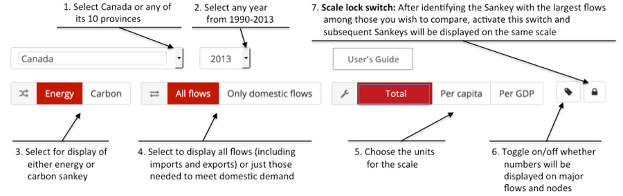
Figure 4. Control panel for the CESAR Sankey diagrams.
This figure also identifies the seven (7) options that the user has to display the visualizations, including:
- Region to be visualized. Select Canada or any one of the 10 provinces. Due to poor data availability, the territories of Canada are included with the data for British Columbia;
- Year. Any year between 1990 to 2013.
- Energy or Carbon. Much of the recent interest in energy systems is tied to concerns about climate change and the greenhouse gas (GHG) emissions forcing that change. Carbon dioxide (CO2) and methane (CH4) are the two most important GHGs and their flows are the sole focus in the carbon sankeys. Therefore, the magnitude of the differences in the sankeys that depict energy and carbon flow for a given region and year is a useful way to illustrate the relative C intensity of regions, years and sectors.
- All flows or domestic flows only. Canada is a major producer and exporter of energy resources, so Sankey diagrams showing total flow tend to hide the domestic demand, especially in provinces with large energy exports. For this reason, we have created an option to show only the domestic flows of energy and carbon. In the domestic-only Sankeys, the primary energy inputs do not differentiate between imported and domestically produced energy, and energy /carbon in exports is not shown. For these diagrams, input energy or carbon flows associated with each energy resources is calculated as imports + production – exports.
- Units and scale. The vertical scale for each Sankey diagram can be set to represent three different units for the flow of energy or carbon: total, per capita, and per GDP (2002$). Choose the units that will best answer the questions that you have when exploring these diagrams.
- Display Values. The control panel button with the small ‘tag’ allows the user to turn off and on the display of values for the major flows and nodes in the Sankey. As will be described below, hovering the computer cursor over a line or node will also bring up a value representing the magnitude of that flow or node.
- Scale lock switch: When the control panel button with the lock is deactivated (normal position), the portal will automatically scale each Sankey diagram to fill the available screen space. However, when the lock button is activated, it freezes the scale of the diagram being displayed and uses that scale to display all subsequent sankey diagrams until the switch is deactivated.
This is a very useful feature if there is a desire to show how the energy or carbon flows have changed over time, or to make interprovincial comparisons (hint: first select per capita or per GDP scaling). To use this feature, the user must first identify the Sankey diagram that has the largest flows among those you wish to compare. Then activate the lock, and move to display subsequent Sankey diagrams. Note that you will probably need to ‘clean up’ all subsequent diagrams (especially relocating the electricity generation node, see below for details) before taking a screenshot of the image.
Direct Interaction with the Sankey Images
Once you have selected the sankey visualization of interest, the CESAR portal makes it possible to interact with the images to either extract additional information, or to make the image easier to understand or communicate.
Three tools are available:
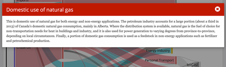
Figure 5. Example of a pop-up window that can be accessed by single-clicking on the major flows or nodes in the Sankey diagram. To close the box and return to the Sankey, click on the X in the upper right corner.
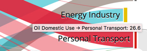
Figure 6. Small pop-up window showing that 26.6 Mt C/yr was flowing to personal transport from the domestic use of oil in Canada in 2013.
- A Single Click on any flow or node will bring up a description of that part of the Sankey (Figure 5), and may also give information regarding how this aspect of Canada’s fuel and electricity system differs among provinces, or how it has been changing with time. This information could identify other sankey diagrams that users may wish to explore.
- Hover over a flow or node, and a brief description of that node will be displayed along with a number reflecting the magnitude of the energy or carbon associated with that part of the sankey (figure 6). The number will be in the units that you have previously selected for the image display
- Clicking and holding on a node allows the user to relocate the node on the diagram and ‘tidy up’ Sankeys to meet the needs of the user. This feature is especially useful if the user employs the scale lock switch to generate a number of Sankey diagrams that are all on the same scale.
For example, Figure 7A shows the per capita flow of energy for Alberta’s domestic only energy system. The scale lock switch was activated and then the CESAR portal was asked to display a similar Sankey for Ontario. Figure 7B shows the resulting Sankey diagram. To make the diagram more presentable, the ‘click and hold’ method was used to relocate the nodes (Figure 7C). A comparison of Figures 7A and 7C provides a graphic illustration of per capita energy use in the two provinces.
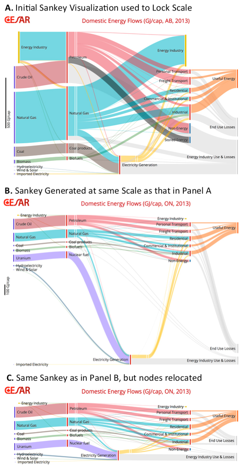
Figure 7. Interprovincial comparison of per capita domestic energy flows in Alberta vs. Ontario in 2013 to show the effect of the scale lock switch, and the ability to relocated nodes. All panels are displayed at the same scale.
How the Sankey Diagrams were Created?
CESAR created these images using the Sankey plugin from D3, a javascript library for manipulating documents based on data.
Most of the data used to create these visualizations were obtained from the Canadian energy systems simulation (CanESS) model. This model was built and is owned by whatIf? Technologies Inc, an Ottawa-based modeling company. CanESS is a technology-rich, bottom up stock and flow model of the energy systems of Canada by province. The CanESS model draws heavily on federal and some provincial government data, but cross-checks and calibrates the values to create a coherent, internally-consistent, simulation of the energy systems of Canada by province. Hence, embedded within each of the flows and nodes depicted by the Sankey diagrams, there is an incredible amount of detailed information supporting the values presented.
CESAR appreciates the generous contribution from a donor to the Edmonton Community Foundation for making the resources available so that we can provide this service. If others would like to support CESAR’s efforts to enhance the knowledge and understanding of energy systems and energy systems change, please contact CESAR Director, David B. Layzell at dlayzell@cesarnet.ca.
Do you want to Use images from the Cesarnet.ca Website?
![]() The Sankey portal on the cesarnet.ca website has been created to enhance knowledge and understanding of the energy systems of Canada, and to elevate a critically needed discussion across Canada regarding how best to transform our energy systems towards sustainability.
The Sankey portal on the cesarnet.ca website has been created to enhance knowledge and understanding of the energy systems of Canada, and to elevate a critically needed discussion across Canada regarding how best to transform our energy systems towards sustainability.
We are therefore pleased to see our work used by others for non-commercial purposes, as long as the work is attributed to CESAR. Therefore, we license these Sankey diagrams under a Creative Commons Attribution-NonCommercial 4.0 International License.
For those wishing to use the sankey images for teaching, research or non-commercial purposes, we request the following:
- Every Sankey image must have the CESAR Logo affiliated with the image. If you wish to crop out the logo that comes with the image on the website, then we expect you to embed our logo into some part of the image that is retained. An oversized copy of our logo can be found at the end of this document;
- If you would like to use the image in a publication (whether or not it will ever be printed), we also ask that the following statement be made about image either in a figure legend, or footnote: “image created by CESAR (cesarnet.ca) using data from the CanESS model”;
- Please send an email to info@cesarnet.ca telling us how you have used the visiualizations. This information is valuable to us as we search for resources to maintain this servise
If users would like to use any of our images for commercial purposes, please contact the CESAR Director at dlayzell@cesarnet.ca with details regarding your planned use for these visualizations
How to Download the Sankey images?
The simplest way to get a good quality image of a visualization is to make a ‘screenshot’ of the image when you have it in the form you want to see it presented. This approach works well for most applications.
However, if you want a high resolution, vector graphics image that can be edited and/or scaled for large size printing, then please contact us at info@cesarnet.ca.
Footnotes
1 The Canadian Energy Systems Analysis Research (CESAR) Initiative at the University of Calgary has created these Sankey diagrams by drawing on the historical, calibrated data in the Canadian Energy Systems Simulator (CanESS) model, a product of WhatIf? Technologies Inc, Ottawa, ON